An assessment of relevant economic indicators
- Details
- Category: Economics
- Hits: 7,195
Because of the importance of understanding the status of the economy today to be able to predict the future, not all indicators need to be leading the economy. This means that not all indicators included in the approach will have strong predictive abilities. But as this is a forecasting approach, the assessment of the different indicators will always point towards their possible implications for the future.
The indicators are chosen to give a broad, but still detailed, understanding of the state of the economy. Since the definition of a recession is a broad negative trend in total economic activity, it is important to collect information from several different sectors of the economy. As will be seen I have also chosen more than one indicator for most of the relevant markets, and this is to protect against false signals in single indicators. From analyzing more than one indicator on each market, you are more likely to detect any false signals and to avoid biased forecasts.
The indicators included are picked as good indicators for real-time forecasting based on the attributes from section 5.4. Even though this analysis is produced ex post of the 2007 recession, the indicators included in this forecasting approach are put together so that they could work as part of a real-time forecasting approach which could easily be implemented by companies and private investors for future forecasting. With this said, the scope of this paper means that I have to eliminate some indicators which can be of great interest such as the number of auto sales and the price of oil. The indicators which will be explained are hence not an exhaustive list, but rather an introduction to some of the most popular economic time series.
In the following there will first be a description of broad indicators holding information about the total production levels, the current account, inflation and the yield spreads. The indicators will then shift towards the corporate developments, the employment situation, the propensity to consume and the housing market, before having a look at a leading index created by The Conference Board.
Gross Domestic Product and the CI index
Gross Domestic Product (GDP) is arguably the most famous economic indicator of all. GDP is a measure of total economic output and is as explained earlier moving much correlated to the business cycle 1 2. This paper has earlier discussed some of the weaknesses of the GDP announcements, namely its late appearance and numerous revisions. But despite this, one should always pay attention to this release date as there could always be surprises.
In terms of forecasting the lag is a problem and the movements are as explained in section 3 coincident with the business cycle. Still the detailed GDP report contains much specified information which certainly could be used to get a better understanding of the current state of the economy. As the revised GDP is the actual total production in the economy, it could be used as an important control on the coincident index which The Conference Board uses as the measure of total economic activity.
Section 4 has already discussed some of the empirical developments of GDP pictured in figure 1, and explained its cyclicality through a business cycle model. The predictive power from this indicator comes most importantly from understanding where we are in the business cycle at the current point of time. This information should be used in conjunction with the cycle theories already explained in section 4. Because of the reasons already discussed, the CI will be used as the main measure of the US business cycle during the analysis of the 2007 recession in section 7.
Current account and the exchange rate
At a quarterly basis the value of the US current account is released by the Bureau of Economic Analysis. The data rarely suffer from revisions, and hold a broad measure of the US trade and investment relationship with other countries. In short the indicator holds the sum of income and payments to and from the rest of the world (Blanchard 2003).
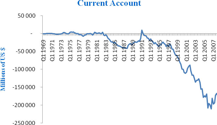
Figure 3 - US Current account. Quarterly data.
As can be seen from figure 3 the US current account has been negative for most quarters since the early 1980s, except for a short period at the positive end in 1991. A negative current account means that there is a bigger capital flow into the country than going out, and the country is thus borrowing money from foreign economies. While a deficit could be a sign of overspending or bad planning, it could just as well be a case of a strong economy which is borrowing abroad to help boost further growth at home. It is the latter argument that is mostly used on the US, since the US economy is arguably one of the biggest and most liquid economies in the world, and because many other countries are so dependent on keeping US dollar reserves 3.
But as with all debt there are some risks involved. This is why the deficit needs to be watched closely, and why this indicator is of importance also for the forecaster. One of the many potential dangers connected to the US current account deficit, is if any of the countries which have pegged 4 their currencies toward the dollar decides that they want less exposure towards the US economy5. If they decide to do this they will also need less US dollar reserves and are likely to invest less in the US stock markets. If this is to be the case one can expect the stock markets and the currency to weaken as foreign investors pull out some of their investments.
Another negative view on the deficit is that it is actually showing that the US economy is losing competitiveness compared with the rest of the world. As will be examined later, the US savings rate is at approximately zero percent which means that the US consumers are very willing to spend. But the record high current account deficit suggests that much of this spending is going abroad resulting in a negative trade balance and finally a weaker local industry. Fears are that this will eventually mean lower profits to the local industry, and hence less future jobs (Ferguson 2005).
From figure 3 there is a tendency of positive growth in the current account during recessions 6, and as the deficit is so large it could be a useful indicator to follow in conjuncture with for example the stock markets and the currency. If foreign investors were to decide that the deficit is too large and that they want to remove some of their exposure to the US economy, we can expect to see a drop in the stock markets together with a weaker currency as they pull some of their funds out of the country. As the deficit is at record levels this could be a real threat, and there is broad agreement that there is bound to be improvements and that the deficit cannot be allowed to become much larger (Ferguson 2005).
This indicator is in other words represented by a deep negative trend, which has lasted over a substantial duration. The relatively low cyclicality of the indicator means that this should not be expected to lead the business cycle, but the possibility of a broad financial crisis as a result of the amount of US government debt, means that the developments indeed could be a danger sign which should be considered by forecasters and analysts of the US macro economy.
Inflation
The rate of inflation is an important part of the economy which is relevant for all consumers and investors. Volatility in prices is important both in terms of costs of consumption and doing business, as well as it’s a vital factor when negotiating labor contracts. To control the price volatility and give consumers and investors a more predictable economic environment, price stability is normally one of the main objects of the national bank. Some even sets long term inflation targets which they use monetary policy to control. As this indicator carries so much influence in the markets, it is only natural that it also should carry influence in a forecasting analysis.
In the US the Federal Reserve (Fed) stated in January 2009 that they were currently working with an inflationary target of 2%. 7 Even though this might be their first concrete long term inflationary target, this might not influence much change in the way the Fed works towards price stability. The US Fed has already been working with a goal of price stability and low inflation for years, and Alan Greenspan managed during his period as chairman of the Fed to successfully stabilize the core inflation rates between 0 and 1%.8
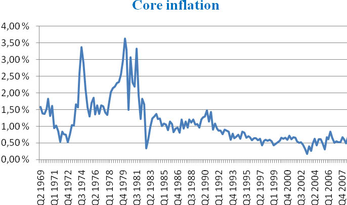
Figure 4 - Core inflation, calculatei! from CPI less food and energy
Figure 4 clearly shows the increased stability in price changes since 1985. This price stability enhances resource allocation and the efficiency of markets as it becomes easier for consumers and investors to foresee future price changes.
Whether National Banks should choose to use an inflation target is out of the scope of this paper, but the decision is still of importance in terms of forecasting. If the National Bank successfully follows an inflationary target the developments of inflation should as a result be more stable and it might be easier for the forecaster to predict when the National Bank will change the direction of their monetary policy to keep inflation within their goals.
Inflations above normal are often followed by a contraction in monetary policy, which again often results in a slowdown in consumption and economic activity. The rate of inflation can in other words hold important predictive information on monetary policy, which again is a vital influence on the business cycle.
From figure 1 we can see an increase in inflation ahead of the 1991 recession, from 0,96% in Q4 1989 to 1,30% in Q2 1990. The increase is significant, but still within levels which was normal at the time. In Q1 of 2001 there was an inflation of 0,73% up from 0,44% in Q1 1999. The best sign was probably in Q2 2006 when the inflation reached 0,85% which was the 9 highest levels since the early 90s, and which hence was very likely to be followed by increased interest rates.
During times of recession the inflation rates might hold more information also for countries with target levels. Specifically it might hold information about the amplitude of the recession. Japan has become a classic example of an economy suffering from a liquidity trap 10 and deflation which saw the once so strong high-growth economy suffer during the lost decade11 of the 1990s. The other extreme can currently be seen in Zimbabwe where economic growth is at a minimum while they at the same time are suffering from hyper-inflation 12. Both scenarios are extreme and put policy makers in difficult positions when trying to get their economy stabilized again. These examples show that sometimes inflation become harder to control during recessions and hence hold important information on the depth of the downturn.
The fact that the Fed stated a specific long term target at a time when the economy was suffering from the worst recession since the great depression is probably no coincident. Core inflation was for Q4 2008 at only 0,16%, while interest rates were already at levels close to zero and other monetary adjustments to increase liquidity had already been implemented. Through deciding on a specific inflation target the Fed tried to increase consumers’ confidence in the market and further increase the transparency of their policies. But still at the time of writing, economists with high influence, such as Alan Meltzer and Nobel Prize winner Paul Krugman, are stating their respective warnings about the possible dangers of deflation or inflation in the US economy.13
As a sum up the rate of inflation is important for understanding the state of the economy and can indeed give pointers on how the interest rates will change in the future. For countries who are working with specified targets for their inflation we should not expect any great volatility but it should still not be underestimated as an economic indicator which can hold predictive information, especially about the future yield curve and the depth of economic downturns.
Theyield curve
The yield curve has probably been the most consistent predictor of future business cycle peaks in the US, and has gathered much attention from researchers of the business cycle. The reasoning behind the strong relationship between the yield spread and the business cycle has been heavily debated with most researchers concluding that investor expectations and monetary policy are the main reasons behind its predictive properties.
The influence of monetary policy and investor expectations
During periods of high economic activity and strong demand for credit, we often see a tightening of monetary policy as a way to control inflation and to stop the economy from blowing bubbles. This means that we can expect interest rates to be increased in times of high economic activity, as monetary policy enters a phase of contraction. As monetary authorities increases the interest rates, the yield curve experiences a jump in the short end while the long end, which reflects the long term expectations, are less influenced by short term policy changes (Estrella and Trubin 2006). This increase in the short end diminishes the slope of the yield curve which either flattens or becomes inversed 14 depending on the developments in the long term expectations.
The theory that investor expectations influence the yield curve helps explain movements in the long rates. The cyclical nature of the macro economy leads to expectations that the slowdown in investments as a result of the contracting monetary policy, will result in lower future profits and employment. This is eventually expected to evolve into a downturn in inflation and total economic activity 15. As downturns in inflation and total economic activity are normally followed by a more expansive monetary policy, interest rates are hence likely to fall in the future. As a result we might see a drop in the long end of the yield curve while short term monetary policy is contracting. This further deteriorates its slope and results in a yield curve inversion.
The cyclical nature of the business cycle means that periods of increasing interest rates are often followed by a slowdown and downturn in economic activity. This together with the role of investor expectations means that we should expect the yield curve to be forward looking and a leading indicator
Empirical evidence
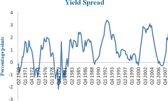
Figure 5 - The Yield spread between 10 year and 1 year US treasury
Figure 5 show the yield of a 10 year US treasury less the yield of a 1 year US treasury, and it gives a clear picture of the tendency of an inverting yield curve ahead of recessions. The yield curve inverts ahead of each of the dated recessions from table 1, and in most of the cases as early as one year ahead of the business cycle peak. The relationship does not hold any false signals over the period examined, and seems to hold crucial information about future economic activity.
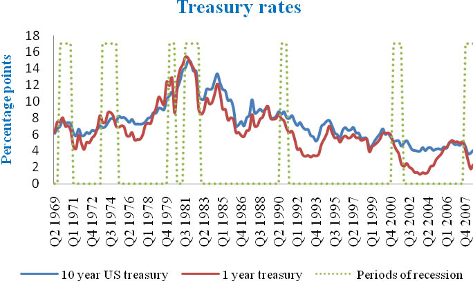
Figure 6 - Empirical yields for a 10 year US treasury and a 1 year US treasury
Through a closer look at the respective rates’ separate developments in figure 6, we can see that the short rates increases in the periods of yield curve inversion. This is as indicated by the underlying theories explained in section 6.4.1. The long rates are as expected not as volatile as the short rates, and are not consistently falling or increasing in the times of yield curve inversion. During the early recessions in the data shown in figure 6 the long rates increases in the periods in question but not as much as the short rate. Ahead of the 2001 and 2007 recession on the other hand, the long rates falls or are relatively stable.
This inconsistency suggests that it is the movements in the short end of the yield curve that are the main reasons behind the inversion. But Estrella and Hardouvelis (1991) show that there is more predictive information in the yield curve than explained by the movements in the short interest rate alone, indicating that expectations towards inflation and future levels of investments are indeed relevant, and that the spread is more relevant to forecasters than the short rate alone. This can also be seen through figure 6, where an increase in the short rate is not necessarily followed by recessions. As monetary policy is mainly used in the goal of stabilizing the economy, there are relatively long periods of increasing short term interest rates in the years 1983-1984 and 1993-1995 respectively, which did not result in any immediate recessions.
This supports the view that the yield curve contains information beyond short term monetary policy.
Choosing between interest rates
How to choose the interest rates used to compute the spread is also a relevant question. As many different researchers have tried many different combinations of interest rates in their work, Estrella and Trubin (2006) had much empirical evidence when suggesting some ground rules to the choice of yield spread. The first consideration is that you choose rates with much and consistent historical data. The treasury yields are the natural choices in the US as they have a long and consistent history. They also suggest that spreads between interest rates with maturities far apart give the best forecasting results. With this in mind, the 10 year treasury rate becomes the natural choice in the long end 16. At the short end the choices are many with positive forecasting evidence from the use of the 3 month, 1 year or 2 year treasury, or the federal funds rate 17 (Estrella and Trubin, 2006). My choice of using the 10 year and 1 year treasury rates fits well to these categories, and show excellent empiric forecasting abilities.
Also the choice of data duration is relevant to the analysis. With lower duration the data often becomes more volatile, and on daily and weekly data the yield curve often gives false signals. Estrella and Trubin (2006) found over 100 false signals from yield curve inversion when analyzing daily data for the period 1968-2005. In contrast they found no false signals using monthly data. I chose quarterly data as this gives less volatility, and even more reliably signs of recessions than the monthly data.
In real time forecasting it might be a good idea to use both monthly and quarterly data if possible. Monthly data could give strong indications, but if the yield curve average over the quarter is still negative, the duration of the signal should be interpreted as a significant increase in the probability that the economy will be reaching a business cycle peak followed by a recession within the following 12 months.
Will the yield spread forecast equally well in the future?
Even though an indicator has played an invaluable role in past forecasts, there is always uncertainty connected to whether it will prove equally successful in the future. This is also the case for the yield curve. While past performance have been impeccable, changes in future market behavior could result in the yield curve becoming less powerful as a forecasting tool. Estrella and Hardouvelis (1991) argues that one potential threat to its usefulness in the predictions made by private forecasters is that monetary authorities start actively using the yield curve as a leading indicator in their approach towards monetary policy.
They argue that the relationship between the yield curve and economic activity is not necessarily policy invariant, and it is hence likely to change as the authority changes their approach to monetary policy. As a result the yield curve is only likely to keep its predictive qualities if future monetary policy and market behavior is executed in a more or less similar fashion to what we have experienced in the past, or if future monetary policy is neutral47 such that the developments in the yield curve are only explained through future expectations.
Even with these potential problems it is important to remember that it has successfully forecasted all recessions after the article by Estrella and Hardouvelis in 1991, and it still stands out as the indicator with the strongest predictive abilities. Nevertheless, it is an important point that a change in future market behavior, for example as a result of a shift in the work of monetary authorities, could indeed have an impact on the future predictive power of the yield curve. This again points to the importance of including multiple indicators in economic forecasts, and to the dangers of blind trust in past correlations from single time series.
Corporate developments
The developments within corporate profits, valuation and activity are obviously of great importance for the state of the economy as a whole. This is first and foremost because the general wealth of business set the standard for the possibilities of consumers to get employment and general financial prosperity. In this section economic indicators with information in regards of the state of the corporate developments will be examined through 18 the light of economic forecasting. First the corporate profitability and stock returns will be examined, then the amount of new orders of durable goods and finally the NAPM 19.
Corporate profits and stock markets
The growth in corporate profits gives important information towards the value being created and what we can expect in terms of future corporate investment and employment. The growth rates of corporate profits are relatively volatile, and has over the years carried some false signals of business cycle turning points. But this does not mean that this indicator cannot be used as part of a forecasting procedure. Analyzed as part of a broad specter of economic indicators, corporate profits tend to hold interesting information in the months before business cycle peaks and troughs.
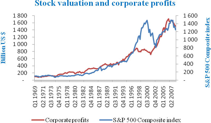
Figure 7 - S&P 500 composite index and US corporate profits. Corporate profits are found on the left
axis, and the S&P 500 composite index is on the right axis20.
From figure 7 we can see that both in the months before the recessions starting in December 1969, January 1980 and March 2001 there were clear signs of negative growth in corporate profits21. This supports the view that even though its volatility makes it hard to analyze as a single leading indicator, this indicator might still hold valuable information as part of a broader analysis.
The developments of corporate profits also play an important role for the valuations on the influential stock markets.
Equation 1.0
Equation 1.0 holds the definition of the pricing of stocks, where the stock price (P) today is the sum of the future dividends (DIV) discounted by the proper discount rate (r ) (Brealy, Myers, Allen, 2006). In other words, the valuations on the stock markets are based on the future expected dividends which again are strongly linked to the announced and expected future corporate profits. This gives a theoretical expectation of a drop in stock markets ahead of recessions as a result of changes in investor’s confidence in the future.
If the economy enters a recession the future corporate profits are expected to fall, and hence so are the future dividend payouts. As investors think there might be a downturn approaching, with lower corporate profits and dividends, they per definition also expect an increased risk of falling stock prices. While this fear of a recession increases, investors often want to reduce some of their portfolio risks and seek to sell stocks and secure some of the profits generated during the growth phase of the business cycle.
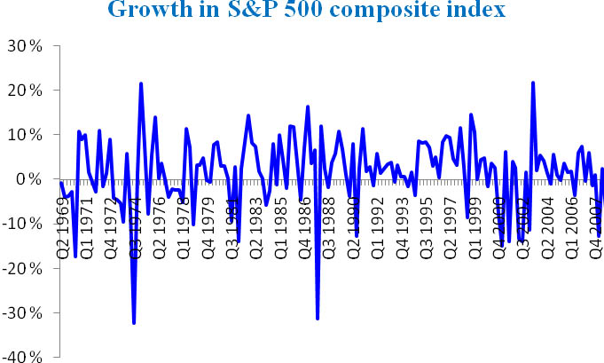
Figure 8 - Growth in S&P 500 composite index
Even though figure 8 is based on quarterly data the growth rates in the S&P 500 composite index have been relatively volatile. In the same way as for corporate profits this means that one should be caretul with putting too much emphasis on this indicator alone. But the fact that the prices are based on the forward looking expectations of investors, gives a theoretical foundation for the inclusion of stock markets in economic forecasting.
Empirically we can find tendencies of negative growth in the S&P 500 composite index ahead of almost all the recessions from table 1. Both ahead of the 69 and 73 recession there were 3-4 quarters of negative growth in the index just before the recession. Before the recession starting in January 1980 there were some signs of investors taking profits especially in May and October of 1979. Ahead of the 1990 recession you could see the same trends of investors taking profits during November 1989, and January and February in 1990. Before the 2001 recession the S&P 500 index experienced a steep decline in October 2000, and finally before the business cycle peak in 2007, the index experienced a significant decline in August 2007. It should also be noticed that there have been some false signals. 1977 is an example of a generally bad year for the S&P 500 composite index, but there were no official recession before January 1980. 22
Figure 7 pictures how corporate profits and the S&P 500 index moves relatively correlated. But by viewing these two indicators together one can also see some tendencies that corporate profits are leading the stock market. This can be seen ahead of the recession starting in 2007, where corporate profits flattened and started falling before the S&P 500 index flattened. But what seems to have been the most obvious period of imbalance between profits and stock prices are the years ahead of and during the dot.com bubble. During these years the expectations of future efficiency and profits resulted in an investment boom and souring stock prices, while in fact corporate profits were stagnating during the whole period.
In the analysis of such volatile indicators it can sometimes be useful to collect extra information to help interpreting the developments. The Tobin’s Q formula23 could be of good use in times of uncertainty of the valuation of stock prices. Figure 1 in appendix 1 pictures the developments of Tobin’s Q ratio, which shows especially high valuations in the periods before the 2001 recession and the business cycle peaks in 1969 and 1973. This together with the imbalance during the same period in figure 8 should have been seen as indications that something was wrong in the stock market pricings. These findings support the decision to analyze stock prices and corporate profits in conjunction during economic forecasting, and that periods of extreme growth in the stock market should be explored through fundamentals such as the Tobin’s Q.
New orders in durable goods
The value of new orders in durable goods is a popular leading indicator with high market sensitivity (Bauhmol 2008). The theory behind its predictive abilities comes from the lag between the placing of new orders and the actual deliveries. First, an increase in the orders of durable goods indicates that consumers are having positive expectations for the future, and hence feel confident enough in their personal economy to spend on relatively expensive goods. Second, and more importantly, it also means that production lines still have much work and are likely to generate future profits.
A significant fall in orders will on the other hand suggest that we might see a fall in profits with the result of employment layoffs and shut downs of production lines in the future. The indicator is available at a monthly basis, but it does suffer from revisions.
In this paper I will be looking at monthly data even though they can be relatively volatile. Also one should be aware of any large single orders of for example aircrafts or defense goods which can distort the information in these indicators.
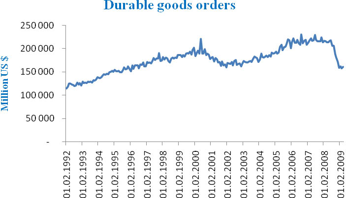
Figure 9 - New orders in durable goods. Monthly data47.
From figure 9 we can see that there was a 6% 24 25 fall in demand for durable goods ahead of the 2001 recession. These tendencies were obvious before the stock market crash, and might have been one of many factors making investors uncomfortable. Ahead of the 2007 recession there was stagnation but no significant fall in new orders.
National association of purchasing managers (NAPM)
The national association of purchasing managers (NAPM) is one of the most popular of the many indicators calculated by private organizations. The index is based on a survey of purchasing managers where they are asked questions about their company and its market performance on issues regarding new orders, production, employment, deliveries and inventories. The respondents are asked whether their company has had a positive, negative or unchanged development within the respective issues, and the answers are later calculated into an index (Forex brokerage firms).
The index is regarded as a leading indicator, and as the questionnaire is made towards purchasing managers it is expected to have especially good qualities in predicting future inflation.
The index holds an interesting trigger point at 50% where results below this level are meant to be a sign that the economy is in a recession, while results above means that the economy is growing. With this said, empirical research has noticed that in practice it seems as results between 43% and 50% is only a sign that the manufacturing sector is in decline while the total economic activity is only slowing. But values below 43% have indeed only been seen in recessionary periods (Forex brokerage firms).
From figure 10 we can see clear trends of falling values ahead of all recessions after 1980. In the years just before the dated recessions there are periods with values around 50% which supports the theories that values around 50 means that the manufacturing sector might already be in trouble while the total economic activity is only slowing down. Further we can find values below 43% during all recessions. Also ahead of the 2007 recession there are signs of a falling trend and values around 50% in the months ahead of the business cycle peak.
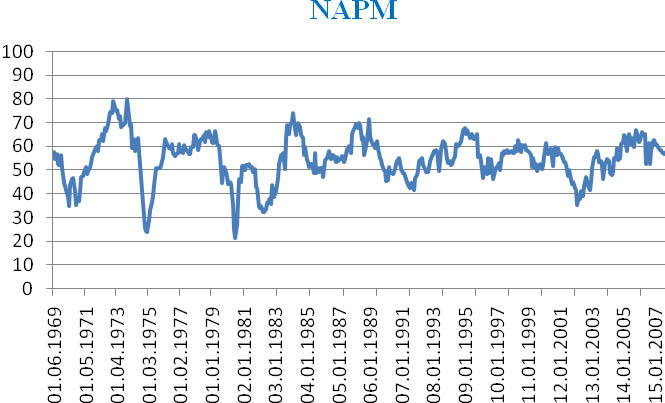
Figure 10 - National association of purchasing managers index. Monthly data.
The employment situation
The economic indicators towards the employment situation are arguably the most influential information about the business cycle available. These indicators alone give a broad understanding of the state of the economy, and also include some pointers on what might lie ahead. While the unemployment rate obviously holds information about the amount of potential consumers being without jobs, it also holds information about the expectations of future corporate profits and demand for goods.
A high or growing unemployment rate might signal that a business cycle peak is imminent, and that future demand and income is expected to fall since enterprises lay off workers. This only continues a bad circle of low expectations since higher unemployment means an increasing amount of potential consumers are without jobs, and are hence likely to spend less.
In this section the history of the forecasting ability and the importance of the unemployment rate and the number of new claims for unemployment insurance will be examined.
The rate of unemployment
The release date at the beginning of each month is one of the big advantages of this indicator. As it is one of the first indicators available for the past month and because it carries so much influence throughout the economy this indicator gets a lot of attention. This is even though revisions are sometimes major and going back several months (Baumohl 2008).
During the growth stage of a business cycle you would expect to see a low (diminishing) unemployment rate which means that the economy is growing and both producing profits and jobs for the consumers. As both the demand for workers and the employment increases, employees get more strength in their contract negotiations and wages are hence expected to increase. From the much debated Phillips curve which again has received some positive arguments in the prize winning book by Robert Shiller and George Ackerlof in 2009; Animal
Spritis, we expect inflation to increase as unemployment falls26. This means that at one point of the diminishing unemployment rate, we might expect an increase in inflation resulting in monetary policy contraction and a future business cycle slowdown. This does not mean that increasing employment is bad for the economy. Quite opposite is increasing employment a great sign of a prosperous economy. But nevertheless, knowing that it with high likelihood will be followed by a monetary policy contraction and that the economy historically moves in recurrent cycles, these signs simply mean that we should be aware of more information from other economic indicators on whether the economy might be heading towards a slowdown or continuous growth.
At the other end of the business cycle, recessions normally brings an increasing unemployment rate. As corporate profits diminishes and consumers decides to save rather than spend because of the possible threat of losing their jobs, the economy often enters a vicious circle where consumption falls and corporations experience lower demand for their goods or services. This again results in even more potential consumers without jobs and consumption keeps falling. At these recessionary times we often see expansions in monetary policy to counteract the downturn and to nourish private investment and corporate profitability.
Shiller and Akerlof (2009) argue that laying off workers is the last step of many companies as they try other possible savings before going to this step. This means that we probably should not expect the unemployment rate to be leading the economy by many months. Instead we could expect to see low levels of unemployment to be accompanied with increasing interest rates, as the Fed is working to avoid bubbles, and to support a more stable economic activity. This monetary policy contraction is in turn likely to slow down growth, and should hence give a warning that a business cycle peak could be close.
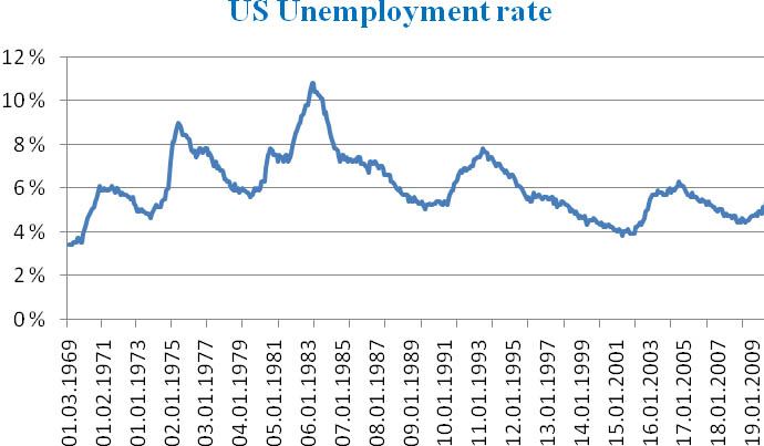
Figure 11 - US monthly unemployment rate.
From looking at the developments in the unemployment rate in figure 11 and the 1 year yields over time in figure 627 there is much evidence supporting these theories 28. In general there is a trend where the unemployment rate is reaching its low in the months before the dated business cycle peaks. At the same time we can see from figure 6 that the yields on the one year Treasury bond is increasing at the same time, which is already stated to be a possible sign that the business cycle is moving towards its peak 29.
The expected opposite results are evident when looking at the empirical tops of the unemployment rate. As the unemployment rate is increasing towards high levels, interest rates tend to fall. But while the unemployment rate falls relatively steadily during periods of economic growth and hit its bottom levels in the months before the business cycle peak, it tend to increase quickly during recessions. During the 90-91 and 2001 recessions it also didn’t hit peak before over a year after the NBER dated business cycle trough.
New claims for unemployment insurance
Even though this economic indicator has been available since 1967 it is only in the later years, after improved monitoring by the Labor Department, many economists have started using this indicator in their forecasting approach (Baumohl 2008). The number of initial claims for unemployment insurance is made official on a weekly basis and gives a good indication on whether the economy is growing and whether jobs are being created or lost. The reasoning behind this indicator is that most employees that lose their job in the US have rights for compensation in form of unemployment insurance for up to 26 weeks 30. This means that we can get a good pointer on where the unemployment and the economy are moving through monitoring the growth in the number of new claims.
As people lose jobs both in periods of growth and in periods of recession, the weekly data usually carry high volatility. I have therefore chosen monthly numbers in level terms to get a good and practical visualization of potential trends ahead of business cycle turning points.
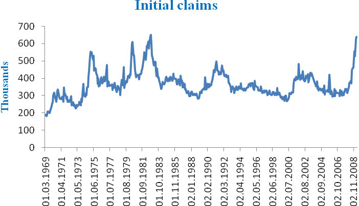
Figure 12 -US Initial claims for unemployment insurance.
From figure 12 the high variation is evident, especially in the years before 1984. But before the recession starting in July 1990 there was a clear trend, although with some high variations especially in October/November 1989, of increasing demand for unemployment insurance. During the period 12.1.1989 - 12.1.1990 there was an increase of 70.000, or 23,4%31, in the monthly number of new claims for unemployment insurance. This means that 6 months before the dated business cycle peak there had been a year of relatively consistent and significant growth in the number of new claims which certainly indicated that the economy was losing jobs, and that a business cycle peak could be imminent.
Ahead of the 2001 recession the sign was perhaps even clearer as the trend was sharper and of shorter notice. After reaching a period low of 268.000 new claims in 12.04.2000 it sustained a growth of 17,5% during the months until 12.08.2000 32, and kept growing towards the dated business cycle peak in March 2001. Again there were signs of significant growth at least 6 months ahead of the macroeconomic turning point.
During the years before the business cycle peak in December 2007 the signs were not as clear. The number of new claims was mainly between 300.000 and 350.000 during the whole period with no specific growth trends before the start of 2008.
The high variation means that one would need a clear pattern over several months before the number of new claims for unemployment insurance can give us any expectations for the future developments in the business cycle. To get more information and better understanding of the developments one could include the numbers of job-cuts and job-openings. The data for these time series are also available at a monthly basis, and could bring some confirmative information about the employment situation.
Consumer confidence and spending
As the economy drives through its different stages of the business cycle one would expect consumer confidence and spending to be moving parallel with other factors such as the interest rates and the employment situation. For example we have often seen that interest rates are at high levels, and unemployment is increasing, as the economy is approaching its peak. In this section I will examine how this affects the propensity of private consumption and the confidence of consumers, and why this is important to understanding the economy and predicting its future path.
Consumer sentiment
During long periods of economic growth the confidence and trust within the economy increases as consumers gain more wealth. As the wealth grows and income and employment is increasing, we often see an increase in risk taking and in the belief of the markets and its participants 33. Recent examples of this are evident both in the 2001 and 2007 recession. The way the stock market boomed during the dot.com bubble without any clear signs on increasing corporate profits, was the result of great expectations and confidence in future growth. The 2007 recession was also the result of immense risk taking by banks, among others, with the result of the so called subprime and housing bubble.
During recessions on the other hand, this confidence and trust deteriorates as investors are losing money on their projects, and employees are losing jobs and income. The current chief economist of IMF, Olivier Blanchard, have also argued that changes in confidence as a result of the Kuwait invasion in 1990 was one important factor behind the recession that followed (Shiller and Akerlof 2009). Bank runs, most recently on Northern Rock, is another good example on how low levels of trust and confidence in financial institutions can create, or worsen, financial instability.
There have been performed several tests in several different countries on the causality between changes in confidence and the changes in the respective countries’ GDP. These tests confirm that the level of confidence is indeed provoking changes in GDP, and not the other way around (Shiller and Akerlof, 2009). This is also one of the reasons why one often hear politicians and economists talk about the need to “restore confidence” during recessionary periods34.
The two most popular surveys on US consumer confidence are the Conference Board’s Consumer Confidence Index (CCI) and the University of Michigan’s Survey of Consumer Sentiment (SCS). They are both put together from questionnaires on consumer’s belief in the strength of the economy, and their expectations for the future.
Because of the fact that the questionnaire for the CCI put more emphasis on the developments in the labor market while the SCS concentrate more on income, some researchers states that the CCI is more of an indicator towards the developments in employment rather than the economy (Bauhmol 2008). As discussed earlier the level of employment is a vital factor in the state of the economy, so it will arguably be relevant also for predicting the business cycle as a whole. But in this paper I will use the SCS since this is the more popular of the two and hence should be the most market sensitive (Bauhmol 2008).
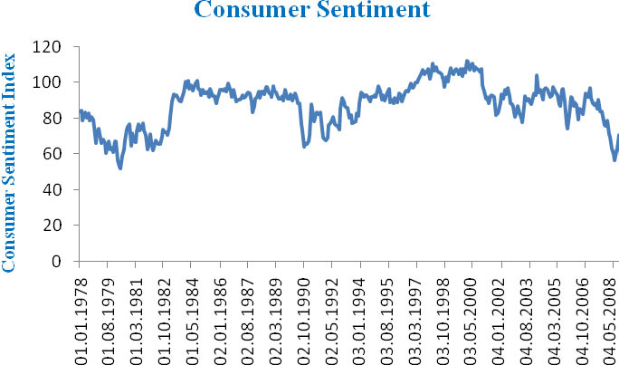
Figure 13 - University of Michigan Survey of Consumer Sentiment. Monthly data.
The SCS is released twice a month with monthly data, and relatively low revisions (Bauhmol 2008). From the data which figure 13 is based on we can see signs of falling consumer confidence during the years ahead of the 1980, 2001 and 2007 recessions, although the fall in confidence in 2007 seems to have been more coincident with the business cycle. As recognized by Blanchard there was a steep fall in confidence in 1990, relatively coincident with both the business cycle peak and the Iraq invasion of Kuwait35.
Consumer spending and saving
As the levels of consumer confidence, employment and interest rates changes one would arguably expect to see changes in the levels of savings and consumption as well. The intuition behind this is that when the future economic expectations are low one could expect consumers to save more for what could be a troublesome future. On the other hand, when the future prospects are bright one could expect the marginal propensity to consume 36 to increase.
Indeed one can often find press headlines stating that “high levels of consumption are driving the economy”. This is not a coincident as consumption is the largest single influence on US GDP (Bauhmol 2008).
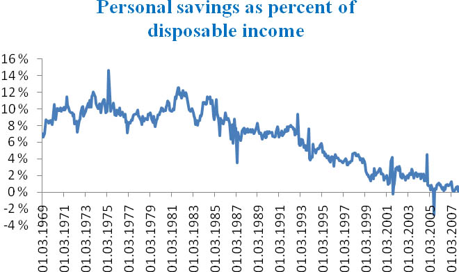
Figure 14 - Monthly US personal savings as percent of disposable income.
The empirical evidence for this is mixed, but there is a tendency of increased savings during recessions and of increased spending at the business cycle trough. But what is striking in figure 14 is that the US savings rate is very low and has been on a falling trend since the early 1980s. As was seen from figure 1 the US economy has, despite some recessionary periods, had a positive trend line. This high growth together with high returns both from the stock markets and in real estate, coupled with a high availability of cash through a credit card boom, has caused the rate of savings to enter negative values in 2005 and staying close to zero after that (Shiller and Akerlof, 2009).
The implications of this if the economy should enter a significant downturn with an increasing unemployment rate, is that some of the consumers who lost their income will on general have only scarce backup resources. This could mean that the economy will experience a more significant drop in consumption during a downturn compared to if consumers had backup savings. It should be noted that the main reasoning behind the unemployment insurance discussed in section 6.6.2, is to stimulate consumption also in times of recessions and high unemployment. This means that even if you were to lose your job you would still have some backup finances. But nevertheless, there is a relevant trend of increasing levels of personal bankruptcies which indeed suggests that the US savings rate might be dangerously low (Akerlof and Shiller 2009).
For forecasters the marginal propensity to consume (MPC) holds information on how the growth rate will look like. Keynes would argue that high MPC’s would generate high future growth as a result of economic multipliers, and this might indeed be what we have seen during the high US growth in the period of 1990s and up till 2007.
But for forecasters it should be obvious that negative savings are not healthy in the long run, and that one would expect savings to increase as unemployment and interest rates are rising and the economy are moving towards a business cycle peak. The size of the jump in savings will also have implications on the magnitude of the recession. A growing unemployment rate which considerably reduces potential consumer’s ability to consume, coupled with significantly increased savings from the ones still employed, could have major implications on the depth and duration of a recession.
The housing market
Buying a new house is arguably the biggest and most important investment of the average consumer. As a result of this the housing market is a good indicator on consumers’ confidence in their current jobs and income, as well as their belief in the future. A housing market with a strong demand side signals that consumers are comfortable enough with their personal economy that they are willing to make substantial investments.
It should also be noticed that the National association of realtors could report that as much as 21% of all home purchases in 2007 were made as pure investments without the buyer having any intentions of using the property as their home (Bauhmol 2008). This means that investors are also using the housing market as a financial vehicle for long term investments37, which again suggests that this market is forward looking and that the demand side holds information about investors’ expectations about the future.
There is a wide selection of available indicators to the housing market, but I have chosen the S&P Case-Shiller national homeprice index and the number of new housing units started.
S&P Case-Shiller naţional homeprice index
The S&P Case-Shiller naţional homeprice index is a composite38 of single family home price indices calculated each month for each of the nine US census divisions 39 (S&P). The national index is only made available once every quarter, which is a big drawback in terms of short term forecasting, but it should be noticed that the different indices for different US regions are available at a monthly basis40. One of the arguments that this index still is useful in this analysis, despite it is only updated every quarter, is that one should be vary of using monthly data when analyzing house prices because of biases as a result of for example changes in the size of the houses sold in single months.
Dean Baker (2007) from the Center of Economic and Policy Research argues that single months could by coincidence hold bigger sized houses or houses with greater standard than normal, and hence score higher than normal house prices for that single month. He also argues that research results suggests that exogenous variables such as the weather can have a significant effect on the amount of houses sold and the prices paid for the houses. With this in mind, the methodology behind computing this index is recognized as the most accurate for this asset class, and should hence hold only minimal biases.
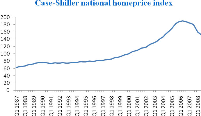
Figure 15 - S&P Case-Shiller naţional homeprice index, quarterly data.
From figure 10 it is obvious that the naţional home prices were relatively stable in the years between 1987 and up till the buildup of the dot.com bubble. At that point the house prices experienced a period of great growth up until its peak in 2006. While the prices suffered a downturn during the 1990 recession, they were growing relatively steadily during the 2001 recession, and noting a growth of 63,4% 41 in the period after the business cycle trough in November 2001 and up to the index peak in 2006. Considering this abnormally high growth in prices, and the fact that the index only experienced negative growth in the months after the peak in Q2 2006 until the business cycle peak in December 2007, the signs of a possible home price-bubble was very evident. Also as explained earlier, this deep and durable decline after the peak in Q2 2006 was an important negative sign on the consumers’ confidence in their private economy and in the housing market as a whole.
New private housing unites started
The number of new private housing units started is simply the number of houses currently under construction. This number holds the predictive information from consumers’ confidence in their personal economy and future as explained in the introduction to the housing market section. But this indicator holds more possible multipliers to the rest of the economy than most other housing indicators. The reasoning behind this is that the building of new houses normally needs more working power in terms of construction workers, carpenters, electricians etc, than the sales of existing homes. In fact Baumohl (2008) refers to an estimate suggesting that the construction of 1000 houses will generate 2500 full-time jobs, and about $100 million in subsequent wages.
As with most big investments, the number of new private housing units started are expected to be negatively correlated to the cost of capital. For most average consumers the interest rates are close to being their cost of capital. This is because most consumers need to take on significant amounts of debt to be able to pay for a new home. This makes another suggestion that we should expect the demand for new homes to fall ahead of business cycle peaks, and we should hence see a trend of falling numbers of new housing units starts in these periods.
The data for this indicator is updated every month, and suffers from only modest revisions. As with the house price data one should be vary of possible seasonality problems in this indicator.
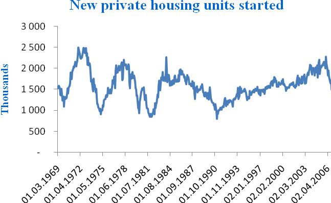
Figure 16 - New private housing units started. Annualized monthly data
Baumohl (2008) suggests that “a healthy housing market is typically one where starts are running at a 1.5 million to 2 million unit annual rate.” Looking at the empirical data which figure 16 is based upon we can see clear tendencies of a falling number of housing starts in times of increasing interest rates ahead of business cycle peaks. The exception is during the 2001 recession where the housing market seemed relatively stable. There is also a tendency that the number of new starts falls below, or is moving down towards the lower point of Bauhmols rule of thumb when the business cycle is moving towards a new peak.
The Conference Board’s leading economic indicators index (CLI)
Earlier I argued that the conference board coincident index is a good choice as the primary measure of economic activity, and as the conference board also produces an index with the purpose to lead the coincident index, it is only natural that this should be taken into consideration.
|
Conference Board US leading economic index |
Weights |
|
|
1 |
Average weekly hours, manufactoring |
25,5% |
|
2 |
Average weekly initial claims for unemployment insurance |
3,1% |
|
3 |
Manufacturers’ new orders, consumer goods and materials |
7,7% |
|
4 |
Index of supplier deliveries - vendor performance |
6,7% |
|
5 |
Manufacturers’ new orders, nondefense capital goods |
1,8% |
|
6 |
Building permits, new private housing units |
2,7% |
|
7 |
Stock prices, 500 common stocks |
3,9% |
|
8 |
Money supply, M2 |
35,8% |
|
9 |
Interest rate spread, 10-year treasury bonds less federal funds |
9,9% |
|
10 |
Index of consumer expectations |
2,8% |
Table 2 - The indicators included in the CLI (Conference Board 2009)
The leading index is put together from 10 different economic indicators which have proven empirically to be leading the developments of the US business cycle. Table 1 shows the respective indicators which are included and their weights in the index 42. While most of the indicators included in this index have already been discussed in separate sections, the others are given a short introduction in Appendix 2.
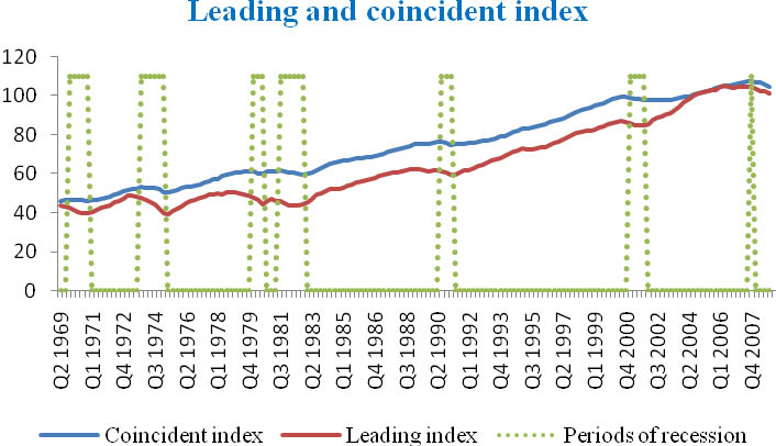
Figure 17 - The Conference Board’s leading and coincident index. Quarterly data
As can be seen from figure 17 the downturns tend to be of higher magnitude in the leading index, and indeed the peaks and troughs are normally found at earlier dates in this index than in the coincident index. The signs seems to be evident between one and three quarters before the turning points in the CI, but ahead of the 2007 recession the leading index reached its peak in Q2 2006, leading the business cycle by over a year.
The Conference Board suggested a rule of thumb in their handbook (2001), stating that 3 consecutive months with negative growth in this index should be treated as a sign that the economy is entering a recession. And it should be noticed, that even though the CLI reached its peak in Q2 2006, it didn’t suffer from 3 consecutive months of negative growth before Q4 2007, which was the same period the business cycle reached its peak.
Indexes like this can be a very helpful shortcut to economic analysis, especially when looking at bigger regions or at the global economy. In a globalized world the economic wealth of your trade partners can hold important information about the future of your own economy. As analyzing the global economy or the economy of all trading partners are difficult and time consuming, global or regional indexes created by for example OECD can be a smart shortcut.
I will not analyze any of these indexes in this paper, but the global financial crisis in 2008 is a perfect example of the influence a global economic downturn can have on single-country economies.
1 NBER produces a calendar of the release dates of many relevant US economic indicators.
2 Indeed GDP is by itself often used as a measure of the business cycle. When analyzing economies that do not have a timelier coincident index, the GDP is normally the preferred choice as a measure of the business cycle.
3 Because the US dollar is arguably the most liquid currency in the world and many countries have a fixed exchange rate system towards the US dollar, some central banks are keeping substantial US dollar reserves.
4 When a country pegs their currency, they lock the value of their currency towards a foreign currency. This is in other words a form of fixed exchange rate system (Blanchard 2003)
5 This is an especially hot topic after the global financial crisis starting in 2007 was mostly blamed on the US, and hence some countries are feeling the risks of being so dependent to one economy. Also the Euro area has grown to be a strong contender.
6 One of many possible explanations for the positive growth in the current account during recessions could be falling imports as consumption falls during the downturn.
7 The Telegraph - The Fed sets first inflation target as it warns US recession will deepen. 19.02.2009.
8 Core inflation is total inflation excluding some of the products with the most volatile prices, such as food and energy. Because of high price volatility within these products they can bias the inflation rate such that it seems as the general price volatility is greater than it really is. Because of this the Fed normally refers to the core inflation.
9 CPI is short for Consumer price index
10 A liquidity trap refers to the situation where national banks has used their possible anti-recessionary actions through monetary policy, but still are unable to stimulate economic growth. For more information see Olivier Blanchard 2003
11 The lost decade refers to the period of economic downturn in Japan from the early 1990s up until year 2000.
12 Hyper-inflation refers to a situation with extremely high inflation.
13 The Economist - The greater of two evils. May 7* 2009
14 An inverted yield curve is a yield curve with negative slope. That is the short term rates are higher than the long term rates.
15 As new investments are abandoned because of the increased interest rates, there is a loss in potential employment and future profits. The loss of profits and the stagnating employment creates eventually introduces a slowdown and downturn in total economic activity. For more information see Estrella and Hardouvelis (1991) or Blanchard (2003)
16 These are the longest maturities that have been available in the US over a long period (Estrella and Trubin 2006).
17 It should be noted that the bigger the difference in maturity on the rates used, the bigger the spread. This also means that spreads between rates with closer maturity might have a higher tendency to invert than spreads between rates with a greater difference in maturities.
18 A neutral monetary policy is a policy which neither stimulates nor slow total economic output and activity (Anderson, Buol and Rasche, 2004)
19 National association of purchasing managers (NAPM). This indicator will be examined in section 5.5.3
20 The Corporate profits in figure 7 are US total, and do hence include some corporations which are not in the S&P 500 index. This means that one should be careful with comparing the two time series, but it still gives a useful indication of the developments.
21 Generally the signs appeared 1-2 quarters before the dated turning points. I have interpreted 2 consecutive quarters of changed growth from negative to positive (and vice versa) ahead of business cycle turning points as signals.
22 I am using quarterly data in the graph to remove some of the volatility and get smoother lines. In the discussion below I will discuss mostly monthly data, but most of the trends discussed should be visual also in the graph with quarterly data. But as is obvious even from the graph with quarterly data, the index is relatively volatile, and graphs might not be the best analysing tool for these types of indicators.
23 Tobin’s Q is a valuation ratio where you compare the firm market value with its asset value. The ratio is calculated as follows: Tobin’s Qt = Value TotalMarke / Value TotalAsset
24 It should be noted that these numbers are not corrected for inflation. To analyze this indicator in real terms one could compare the growth rates with the inflation rates. In this paper this issue is of little relevance since I will only use the data to look for trends ahead of business cycle peaks and troughs.
25 On the 15.07.2000 there were new orders worth $189.644 million, while there were new orders worth $178.257million on the 15.1.2001. 6% = (178.257-189.644)/189.644. All numbers are collected from DataStream®.
26 The Phillips Curve has gained little support in most modern empirical research. But Shiller and Ackerlof suggests some interesting theories on why we still should take this theory into consideration. I acknowledge that the Phillips Curve needs further research after this, but this does not change my arguments that monetary policy tends to contract at times of very high employment.
27 From Figure 6 I look at the short term rate because this rate is as discussed earlier more affected by changes in monetary policy and the business cycle. Again in this analysis one could decide to use other rates such as the Federal Funds rate, but for simplicity I will use the same rates as in my analysis of the yield curves. As he Federal Funds rate and the 1 year treasury yields have a correlation calculated at 0,95 the conclusion of the analysis would be the same with either interest rate.
28 In figure 6 I used quarterly data to create better graphs for the purpose of that section. In this analysis I am using monthly unemployment data because of the timeliness of the availability and the general popularity of analyzing this indicator with monthly data. But as I will only be looking for trends over time and not specific results on specific dates, it is not a problem that the two data-sets are of different durations.
29 As discussed earlier, the potential signs from recessions should be analyzed through the yield curve and not through single interest rates. See section 5.4.
30 It differ whose illegible for unemployment insurance and for how long can vary between states, but on general most employees that have lost their job are illegible for a period of compensation (Bauhmol 2008).
31 On the 12.01.1989 there were 299000 new claims while there were 369000 new claims on the 12.1.1990. 23,4% = (369-299)/299 = 70/299. All numbers are collected from DataStream®.
32 On the 12.08.2000 there were 268000 new claims while there were 315000 new claims on the 12.1.1990. 17,5% = (315-268)/268 = 47/268. All numbers are collected from DataStream®.
33 The amount of risk taking in financial markets can for example be analyzed through corporate bond spreads between bonds from different asset classes (Shiller and Akerlof 2009).
34 One of many examples is Franklin J. Roosevelt’ speech on the great depression in 1933 (Shiller and Akerlof 2009).
35 As stated in the introduction I will not include any detailed discussions on external factors such as wars or political changes, but this is a good example that these factors indeed can be of great significance.
36 The marginal propensity to consume is the factor of your income which you are willing to spend instead of saving for the future (Akerlof and Shiller 2009).
37 I expect these investments to be, in general, relatively long term because of the fact that real estate investments are less liquid than most other financial investments.
38 A composite index is an index created by putting different smaller indexes together and standardizing to get a broad statistical measure.
39 The nine US census divisions are a grouping of US states to give a good subdivision of statistical data.
40 The availability of regional indices is also one of the strengths of this index. This means that you can analyze the growth of different regions compared to the national average. Nevertheless, such an analysis will not be relevant in this paper.
41 Index value in Q4 2001=116,23. Index value in Q2 2006 = 189,93. Growth = 63,4%
42 The weights are inversely related to the standard deviation of the changes in each component (Conference Board 2009). But the actual calculation of weights is outside the scope of this paper.