Consumer Theory, Demand and Income
- Details
- Category: Microeconomics
- Hits: 16,364
Where does the demand curve come from? In order to explain why individuals choose different quantities at different prices, we will use a model with three components:
- Consumers have certain restrictions on how they can choose. Most importantly, they have a budget, but there can also be other restrictions.
- Individual preferences (or tastes) determine how satisfied an individual will be with different combinations of goods and/or services. We measure the level of satisfaction in terms of utility.
- Given preferences and restrictions, the individual maximizes her utility of consumption.
We will now discuss these three components.
Baskets of Goods and the Budget Line
As a consumer, one can choose between several different goods and services. A certain combination of goods and services is called a basket of goods (a bundle of goods, or a market basket). The consumer’s problem can therefore be described as having to choose between different baskets, given the restrictions she faces, such that she maximizes her utility.
We begin by looking at a simple case where we have just two goods, good 1 and 2, with prices p1 and p2. A basket that consists of the quantity q1 of good 1 and q2 of good 2 is written (q1,q2). For example, (4,3) means that we have 4 units (or kilos, liters, etc) of good 1 and 3 units of good 2. The price of the basket (q1,q2) is then:
p1* q1 + p2 * q2
If we have a limited amount of money to buy these goods for, this will impose a restriction on how much we can buy of each good. Letting m denote the amount of money available, the price of the basket chosen must not exceed m. The different combinations of good 1 and 2 that cost exactly m can be written
p1 *q1 + p2 * q2=m
Solving this expression for q2, we get the function of the budget line:

Budget line : A graphical description of the baskets a consumer can buy, given a certain budget.
This function is a straight line that intercepts the Y-axis at m / p2 and has the slope p1/p2 (see Figure 3.1). All the points on the budget line cost exactly m. The points in the grey area below the budget line cost less than m whereas the points above cost more than m. The baskets that a consumer with wealth m can buy are, consequently, the ones on and below the budget line.
There is a simple strategy for finding the budget line: If we only buy good 2, the maximum quantity that we can buy is m/p2, whereas if we buy only good 1 , the maximum quantity that we can buy is m/p1. Indicate the first point on the Y-axis and the second on the X-axis, and then draw a straight line between them. The line you have drawn is the budget line, and it will automatically have the slope -p1/p2.
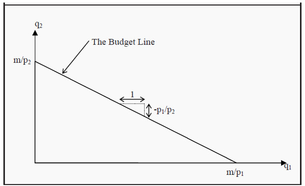
Figure 3.1: The Budget Line
The slope of the budget line is called the marginal rate of transformation (MRT).
We consequently have that
MRT = - p1/p2
Suppose, for instance, that the two goods are ice cream (price 10) and pizza (price 20). MRT will then be -10/20 = -0.5. We can interpret this such that you have to give up half a pizza if you want to have one more ice cream (or, vice versa, that you have to give up two ice creams, -20/10, to get one more pizza).
To transform your basket into another basket with one more ice cream, you have to give up half a pizza. Note that this means that the price of ice cream measured in pizzas (instead of money) is half a pizza.
If income or prices change, the budget line will also change. Look at Figure 3.2 and the budget line B1. If the price of good 1 rises from p1 to p'1, we can only buy a maximum of m/p'1 of that good, but we can still buy m/p2 of good 2. Consequently, the budget line rotates about the intercept with the Y-axis to B2. If, instead, the price of good 2 rises from p2 to p'2, then B1 rotates about the intercept with the X-axis to B3.
When a price changes, MRT also changes since the slope of the budget line changes. If the price of ice cream rises from 10 to 20, MRT will be -20/20 = -1. Now, you have to give up a whole pizza to get one more ice cream. Note that this also means that the pizza has become cheaper, relatively speaking: You can now get one more pizza for just one ice cream, even though the price of pizza is unchanged.
Assume now that the prices are p1 and p2, as they were originally, but that the income increases to m'. We can then buy a maximum of m'/p2 of good 2 and a maximum of m'/p1 of good 1. B1 consequently shifts to B4. Note that the slope of B4 is exactly the same as the slope of B1, since the prices are unchanged: You have more money, but you still have to give up half a pizza if you want to have one more ice cream.
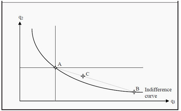
Figure 3.2: Changes in the Budget Line
If prices rise or if income falls, the area under the budget line becomes smaller. In the opposite cases, it becomes larger. The larger the area is, the more choices of consumption you have.
Preferences
The theory of preferences belongs to the most difficult parts of basic microeconomics, so take your time with this section. It is very important to both understand and be able to use preference-theory in the rest of the material.
You have probably heard the expression that “one should not compare apples and oranges,” or something similar. The point here is precisely that one should do that, and even to compare anything with anything else. This is done through a preference order. We will assume that an individual always knows what she prefers: she prefers basket A to basket B, she prefers B to A, or she is indifferent between them. If all baskets are ordered accordingly, we have a preference order and such an order is valid for a certain individual.
Usually, the following four assumptions are made about preference orders:
- Complete. The individual can order all conceivable baskets of goods.
- Transitive. If the individual prefers A to B, and B to C, she also prefers A to C. In other words, there are no “circles” in preferences.
- Non-satiation. An individual always prefers more of a good to less. This assumption is a bit tricky. Suppose we think of pollution as a good. Is more pollution usually preferred to less pollution? No, obviously not. To get around this type of problem, we have to define thegood in the opposite way: Instead of pollution, we define clean air to be the good. More clean air is better than less.
- Convexity. Suppose we have two baskets that an individual is indifferent between, A and B. She will then always prefer (or at least be indifferent between) baskets that lie between these two baskets. Say that she is indifferent between a basket consisting of (2 apples, 4 bananas) and (4 apples, 2 bananas). She will then, according to the assumption, prefer a basket of (3 apples, 3 bananas) to the other two (or, at least, be indifferent between all of them).
Are these assumptions true? Many people have debated the reasonableness of them. Are you, for instance, non-satiable? Which do you prefer: 2 liters of milk or 10,000 liters? Probably 2 liters. The rest will not fit into the refrigerator and will soon start to smell. It will also require a lot of work to get rid of them.
In many models, however, it is also assumed that there are no transaction costs. This means that, there are no costs to trading, except for the price of the goods.
Examples of transaction costs are the cost of a stamp if you mail in an order, the effort it takes to go to the market where you can buy things, or the cost to hire a lawyer to go through a contract before you sign it. Models that include transaction costs become much more complicated, but, on the other hand, they also become more realistic. In the example, you would probably prefer 10,000 liters of milk if it would not cost you anything to sell them and immediately get rid of them. In a worst-case scenario, you would sell then at a price of 0, which should make you indifferent between 2 and 10,000 liters of milk.
Indifference Curves
If we only have two goods, we can illustrate different baskets that the individual if indifferent between with indifference curves. All points on an indifference curve are baskets that the individual perceives are equally good. She is, in other words, indifferent between them. An example of a typical indifference curve is shown in Figure 3.3.

Figure 3.3: An Indifference Curve
After having made the four assumptions above, we can say a lot about what an indifference curve must look like. All points in the diagram (i.e. all possible combinations of good 1 and 2) correspond to a basket. Since the preferences are complete, there must be some preference curve that runs through any point in the diagram.
Another way to say the same thing: Pick any point in the diagram; whichever point you picked, there is an indifference curve running through that point. We now randomly select a point in the diagram, say point A. Since the individual is non-satiable, all points where she gets more of either good 1, or good 2, or of both are better for her. This corresponds to the grey area northeast of point A. Similarly, all points where she gets less, the grey area southwest to A, must be worse for her. Consequently, she cannot be indifferent between basket A and any point in the grey areas. Therefore, a preference curve that runs through A cannot also run through any point in the two grey areas.
This means that an indifference curve will slope downwards. (See, however, the case of complementary goods in Section: Indifference Curves for Perfect Substitutes and Complementary Goods)
The assumption of convexity implies that the slope will become smaller and smaller as we move to the right. Convexity means that, if we randomly choose any other point on the indifference curve that runs through A, say point B, and then choose a point in between them, say point C, then point C must be better than (or at least as good as) A and B. C must therefore lie on a higher indifference curve than the one that runs through A and B. If this is true for any choices of A, B, and C, then the curve must slope less and less the farther to the right we get.
An economic interpretation of this criterion is that, the less one has of a certain good, e.g. the lower q1 is, the less inclined one is to give up one more unit of that good. If that is so, then one will demand more of the other good to com q1 pensate for the loss of that one unit. We, consequently, have to increase q2 more and more, the lower q1 is, to ensure that the individual has the same utility.
And as we need larger and larger amounts of good 2 to keep the individual indifferent after having lost one more unit of good 1, the slope of the indifference curve will increase as we move to the left (i.e. as we reduce good 1), and vice versa when we move to the right.
Indifference Maps
Since the preferences are complete, some indifference curve must run through each point, i.e. each basket. If we randomly choose four baskets, A, B, C, and D, there will be some indifference curve that runs through each point (see Figure 3.4).
If we move to the northeast in the diagram, the level of utility increases. Labeling the indifference curves I1, I2, I3, and I4, they must therefore represent higher and higher levels of utility. A collection of several indifference curves in one figure is called an indifference map. It is common to compare indifference maps to elevation contours on a regular map: It is like walking up or down a hill when one moves from one indifference curve to another.
After we have drawn the indifference curves, we can also compare points that do not lie to the northeast or southwest of each other. In the figure, point B is not to the northeast of point A, but it does lie on an indifference curve that is “higher” than the one that runs through A. Consequently, point B represents a basket that is better than the one represented by point A. We can also see this in the following way: Note that there are points on I2 that lie to the northeast of point A (between the two dotted lines that originate at A).
Those points must therefore be better than A. Moreover, all points on I2 are equally good for the individual (since she, by definition, is indifferent between all of them). Consequently, point B represents a level of utility that is exactly the same as the points on I2 that are to the northeast of A. Therefore, B must be better than A is. Note that if we argue that way, we have used the assumption of transitivity.
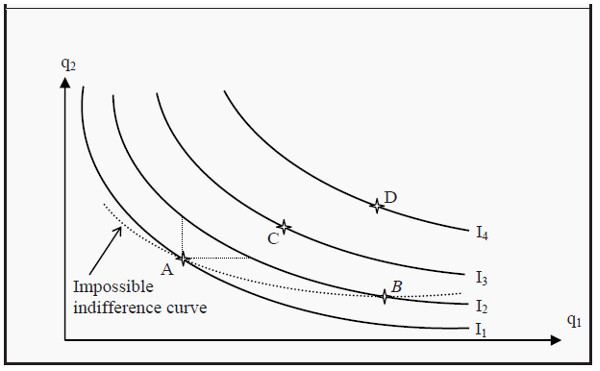
Figure 3.4: An Indifference Map
The indifference curves have the following four important properties:
- Baskets that are further away from the origin (the point (0,0) in the graph) are better than the ones closer to the origin.
- Every point has an indifference curve that runs through it, since the preferences are complete.
- Indifference curves cannot cross each other. This follows from the assumptions of transitivity and non-satiation.
- The indifference curves slope downwards. If they would slope upwards, we would violate the assumption of non-satiation.
The Marginal Rate of Substitution
Look at one of the indifference curves in Figure 3.4. The slope of the curves is of central importance. Think about what the slope means: If you choose some basket on one of the curves, how much would you be willing to give up of good 2 to get one more unit of good 1? If you would be willing to give up only a small quantity of good 2, the magnitude of the slope would be small, whereas if you were willing to give up a lot, it would be large.
Imagine that we have two individuals who each have 5 apples (good 1) and 5 bananas (good 2). To get one more apple, the first is willing to give up one banana, whereas the other is willing to give up two bananas. The first individual’s indifference curve running through the point (5,5) will then slope less than the second individual’s indifference curve.
These two individuals have different tastes regarding apples and bananas. The numerical value of the slope of an indifference curve, the magnitude of the slope, is called the marginal rate of substitution (MRS), and it can approximately be calculated as
MRS= Δq2/ Δq1
Marginal rate of substitution : How much an individual is willing to pay for an additional unit of a good in terms of another good (rather than money). It corresponds to the slope of an indifference curve .
Here, Δq1 and Δq2 are the changes in quantity for good 1 and good 2, respectively. Individual 2 above was willing to give up 2 bananas to get one more apple. Then Δq2 = -2, Δq1 = 1, and MRS = -2/1 = -2. The fact that the indifference curves slope less and less to the right implies that MRS is decreasing.
Often, one does not keep the minus sign in MRS. It is then implicitly understood that one gets less (minus) of one good to get more (plus) of the other. Note that, if one leaves out the minus in MRS, one typically does so for MRT as well (see Section: Baskets of Goods and the Budget Line).
The expression for MRS above is only approximate. The smaller one chooses Δq1, the better the approximation will be. For it to become completely exact, Δq1 must be chosen infinitely small. This, in turn, makes it necessary to use derivatives. That, however, lies outside the scope of this book. Note that the word "marginal" means "infinitely small.” You will hear that word many times in economics.
Indifference Curves for Perfect Substitutes and Complementary Goods
An example of (almost) perfect substitutes we have already seen is green and blue pens. Perfect substitutes have the property that, instead of decreasing MRS, they have constant MRS. This means that they have the same slope everywhere, i.e. they are straight lines sloping downwards to the right (see Figure 3.5). In the case of the pens, we have that MRS = 1/1 = 1 (where we have dropped the minus sign), but MRS could be any number. The defining criterion for perfect substitutes is that MRS is constant.
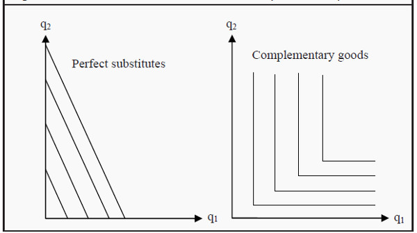
Figure 3.5: Perfect Substitutes and Complementary Goods
The example of complementary goods we saw before was right and left shoes. One has no use for one without the other. This fact causes the indifference curves to become L-shaped (see Figure 3.5). Assume we have two left shoes and two right shoes. Even if we get many more right shoes, we will still have the same utility as before. The indifference curves are therefore vertical along q2 and horizontal along q1, and the only way to reach a higher level of utility is to get more of both good 1 and good 2.
Utility Maximization: Optimal Consumer Choice
So far, we have described two of the three parts we need to explain how consumers choose goods. First, we described their limitations (scarceness; income; the budget line), and then we described their preferences (desires, taste). Now, we put these two parts together. Moreover, if we add the assumption that the consumer will maximize her utility, we will be able to predict which basket of goods she will choose: She will choose a point on an indifference curve that she can afford and that gives her maximum utility. This usually, but not always, singles out one point.
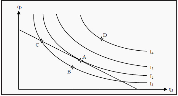
Figure 3.6: Utility Maximization
In Figure 3.6, we see the indifference curves from Figure 3.4 and the budget line from Figure 3.1 combined. Which of the points A – D is an optimal, utility maximizing, choice?
- Is, for instance, point B optimal? No, A is better than B since A is on a higher indifference curve. The consumer can also afford A, since A is on the budget line.
- Is C optimal? No, C is on the same indifference curve as B, and is therefore as good as B. However, A is better than B and, consequently, A must be better than C.
- Is D optimal? D is on a higher indifference curve than any of the other baskets, A – C. It therefore produces the highest level of utility. However, the consumer cannot afford D since it lies outside the budget line. Therefore, D is not an optimal choice.
- Is A optimal? Yes, A is the only basket that, given the consumers indifference curves and budget line, produces a maximum level of utility.
All other points that lie on or below the budget line produce lower levels of utility. At point A, an indifference curve just touches the budget line (i.e. the budget line is a tangent to the indifference curve).
Point A has an interesting property. In that point, the budget line and the indifference curve have exactly the same slope. Remember that the slope of the budget line is (minus) the quotient between the prices -p2/p1, which we called the marginal rate of transformation (MRT), and that the slope of the indifference curves is the marginal rate of substitution (MRS). A criterion for being exactly at the point where we maximize utility is then that

However, there are cases when the point of utility maximization does not fulfill this criterion. Look for instance at the indifference curves for perfect substitutes and complementary goods. If you fit a budget line into any of those graphs, you will find that the criterion MRT = MRS usually is not fulfilled.
For perfect substitutes, the consumer will usually maximize her utility at either the X-axis or at the Y-axis, where she only consumes one of the goods (this is called a corner solution; the opposite is called an interior solution). If the budget line is parallel to an indifference curve, the consumer can choose any point on the line. She can afford them all, and she is indifferent between all of them.
For complementary goods, she will maximize her utility at a point where an indifference curve has a corner. In such a point, the curve has no defined slope (since it has different slopes to the left and to the right) and, hence, MRS does not exist.
Use the following strategy to find the point of utility maximization:
- Draw the budget line.
- Find the indifference curve that just barely touches the budget line (i.e. an indifference curve that the budget line is a tangent to). In most cases, there is only one such indifference curve. All other indifference curves either crosses the budget line or does not touch it at all. Be careful, however, to check if there exists a corner solution.
- The point of utility maximization is the point of tangency (or the corner solution).
More than Two Goods
The method we have described uses only two goods. So, what do we do if we have more goods? One method we can use, if we want to use graphs in the same spirit as before, is to define a sort of composite good as “everything else,” alternatively as “money” (since money represents possibilities to consume something else). Then we can draw a graph where good 1 is the good we want to analyze and good 2 is “everything else.”
Another strategy that is used in more advanced textbooks is the so-called utility function. This mathematical function assigns a numerical value to the utility level of a certain consumption choice. For two goods, the utility of consuming a certain combination of them could be:
U(q1, q2)= q1*q2
Utility function : A mathematical function that gives a numerical value that corresponds to the level of utility a consumer attains.
The utility, U, of consuming, for instance, 2 units of good 1 and 3 units of good 2 will then be 2*3 = 6. The number 6 does not mean much more than that it is better than, for instance, 4 but worse than, for instance, 14. The analysis is then carried out such that one maximizes the value of U, given that the cost of buying must not exceed the budget. If you continue to study microeconomics, the analyses will become increasingly more concentrated on utility functions and less on graphical descriptions. In Chapter 6, we will briefly use a utility function in the analysis of attitudes towards risk.
Demand
Individual Demand
We will now show how to use the theory of preferences from last chapter, to derive an individual’s demand curve. Remember that the consumer’s budget line can change because of changes in prices or because of changes in income. Here, we will assume that the preferences themselves do not change. This makes us able to derive both the demand curve that we used in Supply, Demand, and Market Equilibrium, and the so-called Engel curve, which shows how demand depends on income.
The Individual Demand Curve
As we showed in Consumer Theory, it is possible to find the point of utility maximization if one knows a consumer’s preferences, the prices of the goods, and her budget. Let us now do that, but vary the price of good 1 and see what effect that has on, q1, the quantity demanded.
Suppose we hold the price of good 2 (which you can think of as “all other goods”) constant. Then the effect of varying the price of good 1 will be that the budget line rotates about the intercept on the Y-axis and intersects the X-axis at different points m/p1i, where p1i is the price one has chosen for good 1.
Look at the upper part of Figure 4.1. Suppose the price of good 1 is initially p11. Then the budget line is BL1. We find the indifference curve that just touches that budget line and label the point where it does so, point A. If we would raise the price of good 1 to p12, the possible choices become limited to BL2 (that intersects the X-axis in m/p12) and then the consumer maximizes her utility in point B. If we continue to raise the price to p13, and repeat the maximization, we get point C.
If we would repeat this procedure for all possible prices, we would get a curve that is called the price-consumption curve. It shows how the optimal choice of quantity of good 1 varies with the price of that good, given that preferences, other prices and the income are held constant.
As you can see in the figure, the consumer will usually buy less of the good when the price increases. This is, however, not necessary. To see that, imagine that the indifference curve that runs through point B had been steeper. If it had been steep enough, it would touch BL2 so far to the right that it would also be to the right of point A.
Now we want to find the demand curve for good 1. To that end, we indicate the prices we used for good 1 on the Y-axis in the lower graph of the figure, i.e. p11, p12, and p13. Then we check which are the corresponding quantities demanded in the upper graph, at points A, B, and C, and indicate them on the X-axis in the lower diagram. (Note that both diagrams have q1 on the X-axis.)
After that, we find the points where the quantities and the corresponding prices in the lower diagram intersect, the points labeled D, E, and F. Finally, we draw a line through those points and fill in for all those numerous points for which we have not done the analysis. This curve is the individual’s demand curve for good 1.
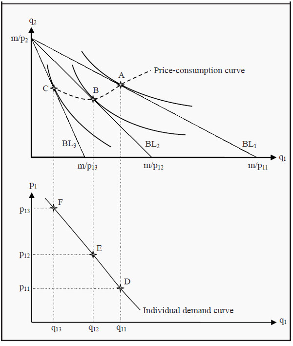
Figure 4.1: Derivation of an Individual Demand Curve
The Engel Curve
In the previous section, we showed how it is possible to derive the relation between the price and the quantity demanded for a certain good. Now, we will instead show how to derive the relation between income and the quantity demanded. The resulting curve is called the Engel curve.
Engel curve : A curve that shows the relation between income and quantity demanded. Compare to the demand curve.
Look at Figure 4.2. Just as in the previous case, we start with the individual’s maximization problem where she must choose quantities of good 1 and good 2. (Again, think of good 2 as “all other goods.”) However, instead of varying the price, we now vary the income m. This means that the budget line will shift outwards for higher incomes and inwards for lower incomes. We assume that preferences and prices are unchanged. For the increasingly higher incomes m1, m2, and m3, the budget lines become BL1, BL2, and BL3.
In the same way as before, we find the utility maximization points for each budget line: points A, B, and C. If we would do that for all possible incomes, we would get the so-called income-consumption curve. That curve shows the optimal consumption of good 1 and good 2 at different incomes, given preferences and prices.
Income-consumption curve : A curve that shows the relation between income and consumption.
Similarly to before, we indicate the quantities that correspond to points A, B, and C, i.e. q11, q12, and q13 in the diagram below. Then we indicate the incomes m1, m2, and m3 on the Y-axis, and the points where the incomes intersect the corresponding quantities: points D, E, and F. Thereafter, we draw a line through the points of intersection, as it would probably have looked if we had performed the same procedure for the points in between. The resulting curve is the so-called Engel curve, and it shows how the optimal consumption of good 1 varies with the income, given preferences and prices.
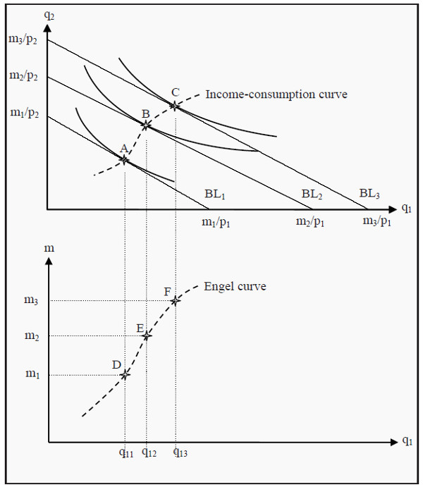
Figure 4.2: Derivation of the Engel curve
Market Demand
The market’s demand consists of all individuals’ demand. To find the market demand curve, we have to sum up the demand of all individuals for each price. Suppose, for instance, that we have found demand curves for three different individuals, and that these three individuals together are the whole market. In Figure 4.3, their demand curves (for simplicity, they are all straight lines) are labeled D1, D2, and D3.
If the price of the good is 4, all individuals demand a quantity of 0, but at a price of 3, the first individual demands 2 units. Since the others do not demand anything, the market’s total demand is those 2 units. For prices between 3 and 4, the market’s demand coincides with D1, i.e. the demand curve of the first individual. (A straight line from point (0,4) to point (2,3))
When the price is 2, the first individual demands 4 units and the second demands 5 units. The market’s total demand is then 9 units. For prices between 2 and 3, total demand is D1 + D2. It will then be a straight line beginning in point (2,3) and ending in point (9,2).
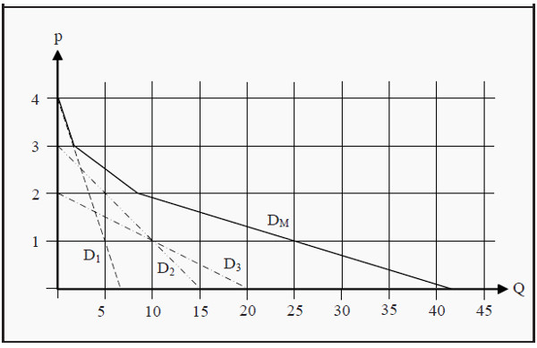
Figure 4.3: Market Demand
When the price is close to 0, all individuals demand it: The first demands 7 units, the second demands 15 and the third demands 20. Total demand is then 42 units. For prices between 0 and 2, total market demand is D1 + D2 + D3. It will then be a straight line starting in point (9,2) and ending in point (42,0). Note that we should not really allow a price of 0. Demand would then be infinite as more of the good is, by assumption, always better.
The market demand curve, DM, will consequently be the sum of the individual demand curves. If the individual demand curves are straight lines, the market demand curve will become a succession of straight lines, where a break signals that a new consumer starts demanding the good at that price.
Market demand curve : A curve that shows the demand for the whole market at different prices.
Elasticity
Suppose we want to study the effects a price change has on the demand of a good. It is practical to do that in terms of percentages: If the price rises by one percent, how many percentages will demand change? More generally, one can study how many percent any one variable changes when another variable changes by one percent. This is called elasticity. The types of elasticity that are used the most are price elasticity, income elasticity and cross-price elasticity.
Elasticity: A measure of how sensitive a variable is to changes in another variable.
Price Elasticity
Price elasticity (of demand) is how many percent demand changes if the price changes one percent. We use the notation ep for price elasticity, Q for quantity demanded, ΔQ for the change in quantity demanded, p for the price, and Δp for the change in price. The price elasticity can then be calculated Note that the expression in the numerator is the relative change in quantity (relative to the level) and the expression in the denominator is the relative change in price.

The elasticity is usually different depending on where on the demand curve it is calculated, even if the demand curve is a straight line. To see that, look at Figure 4.4. We start with point A where the price is 15 and the quantity demanded is 5. For simplicity, we choose Δp to be 1. If the price increases with 1, the quantity demanded decreases by 1 (ΔQ = -1), i.e. we move one step upwards and one step to the left following the arrows. The price elasticity at point A is consequently ep = (-1/5)/(1/15) = -3. If we perform the same exercise at point B, we get that ep = (-1/16)/(1/4) = -0.25.
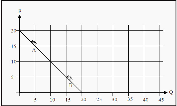
Figure 4.4: Price Elasticity at Different Quantities Demanded
The price elasticity also depends on which type of good we study. Most importantly, one distinguishes between cases where the price elasticity is less than -1 or between -1 and 0. If it is less than -1 that means that the quantity decreases more (in percent) than the price increases (again, in percent), which is called elastic demand. If it is between -1 and 0 it means that the quantity decreases less than the price increases, which is called inelastic demand.
- 0 < ep Positive price elasticity
- -1 < ep Δ 0 Inelastic demand
- ep = -1 Unity elastic demand
- ep < -1 Elastic demand
Note that the good in Figure 4.4 has elastic demand at point A but inelastic at point B. Also note that 0 < ep is very unusual (see, however, Section: Inferior Good). Often, one does not include the minus sign. It is then implicitly understood that, for instance, a price elasticity of 3 means that demand decreases by 3 percent if the price increases by 1 percent.
Income Elasticity
Correspondingly, income elasticity (of demand) is the percentage change in demand if income changes one percent:

Here, em is income elasticity, and m and Δm are income and change in income, respectively. Similarly to price elasticity, goods are grouped depending on their income elasticity:
- em < 0 Inferior goods
- 0 < em Normal goods
- 1 < em Luxury goods
- 0 < em < 1 Necessary goods
A normal good (0 < em) is a good one buys more of if income increases. An inferior good (em < 0) is a good one buys less of when income increases. These goods are typically of low quality, and one decreases one’s consumption of them as one can afford better quality. Normal goods are further divided into necessary goods and luxury goods. If income increases with one percent, one buys less than one percent more of a necessary good, but more than one percent more of a luxury good.
Normal good : A good one buys more of if income increases.
Inferior : A good one buys less of if income increases. Necessary good : If income increases, one buys more of it, but not as many percentages more as the increase in income.
Luxury good : If income increases, one increases consumption by more percentages than the income.
Cross-Price Elasticity
Cross-price elasticity is defined as the percentage change in demand on a good if the price of another good changes with one percent:

Cross-price elasticity : How sensitive demand is to price changes in another good.
Here, e12 is the cross-price elasticity between good 1 and good 2; Q1 and ΔQ1 are quantity demanded and quantity change for good 1, whereas p2 and Δp2 are price an d price change on good 2. Again, goods are grouped depending on their cross-price elasticity (compare with Figure 3.5):
- e12 < 0 Complementary goods
- e12 = 0 Independent goods
- 0 < e12 Substitute goods
Suppose the price of good 2 rises by one percent. If that leads to a decrease in the demand for good 1 (e12 < 0) then good 1 and good 2 are probably goods that go together in some way: complements. If, instead, it leads to an increase in the demand for good 1 (0 < e12) then good 1 is probably something one can buy instead of good 2: a substitute. (Also, compare to Section: The Demand Curve )
Income and Substitution Effects
In Section The Individual Demand Curve, when we derived the individual demand curve, we saw how the quantity demanded changed when the price changed. We will now use consumer theory to perform a slightly more complicated analysis of a price change.
Suppose that we have a consumer, with a certain income, who has to choose between different quantities of good 1 and good 2 (which, again, can be thought of as “all other goods”) in such a way that she maximize her utility. If the price of good 1 falls, we get two different effects:
-
Since the price of good 1 falls, that good becomes cheaper relative the other good. This means that the marginal rate of transformation (MRT; the slope of the budget line) changes. Say that the prices of both goods initially are 1. The relative price is then 1/1 = 1. If the price of good 1 falls to 0.50, the relative price becomes 0.50/1 = 0.50. The consumer can now exchange one unit of good 2 for two units of good 1, and therefore good 1 becomes more attractive to her. As a result, she consumes more of the good. This effect is called the substitution effect.
-
The purchasing power of the consumer becomes larger because of the drop in the price. She can now buy as much as she did before the price changed, and still have money left. That extra money she can spend on both good 1 and on good 2. This is called the income effect.
In reality, we can only observe the total effect of the price change, i.e. how much more or less the consumer buys of the good. However, we will now see that it is possible to split up the total effect into the substitution- and income effects. Depending on whether good 1 is a normal or an inferior good, we get two different cases.
Normal Good
Assume we have the same case as we did earlier: A consumer chooses between good 1 and good 2. Giver her income, m, the prices of the goods, p11 and p2, and her preferences, she chooses that basket of goods that maximizes her utility.
In Figure 5.1, this means that she initially chooses point A. If the price of good 1 falls from p11 to p12, the budget line rotates outwards from BL1 to BL2. When the consumer chooses a new basket, she ends up in point B. Her consumption of good 1 has consequently increased from q11 to q12, which is the total effect.
We now ask ourselves how much of the change in quantity from q11 to q12 that depends on the income effect (i.e. on the increase in purchasing power) and how much that depends on the substitution effect (i.e. on the change in the slope of the budget line). To answer this question, we first ask another question: If only the relative prices had changed, without the consumer getting any increase in utility, what effect had we then seen. If the relative prices change, the slope of the budget line changes.
All budget lines that have the same relative prices as BL2 must also have the same slopes as that budget line. Furthermore, for the consumer to have the same utility as before, she must consume on the same indifference curve as she did before, i.e. on I1. We therefore construct an imaginary budget line, BL*, that has the same slope as BL2 and that, just as BL1, is a tangent to I1. (However, since it has a different slope than BL1, it must touch I1 at different point than that budget line does.) If this had been the real situation, the consumer would have chosen point C.
She had then increased her consumption of good 1 from q11 to q1 *. At the same time, she would have decreased her consumption of good 2. This substitution from good 1 to good 2 depends on the change in the relative price, but it does not result in any change in the level of utility. This part is the substitution effect.
The remaining change, from q1 * to q12, is the part that depends on the increase in the consumer’s purchasing power. As she moves to a higher indifference curve, from I1 to I2, she increases her utility. This part is the income effect.
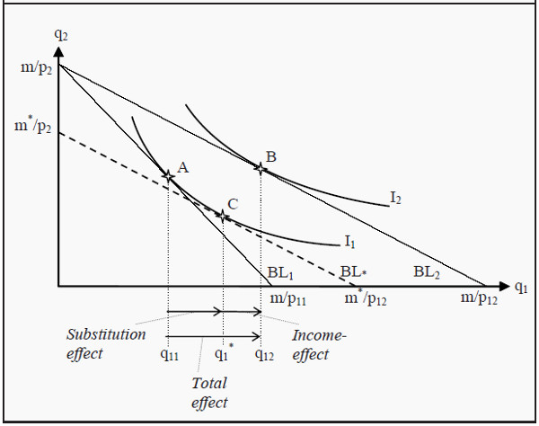
Figure 5.1: Income and Substitution Effects for a Normal Good
Inferior Good
The strategy to find the income- and substitution effects for an inferior good is exactly the same as for a normal good, but the result will look slightly different. As previously mentioned, an inferior good is a good one buys less of if one’s income increases. The underlying reason for that is to be found in the preferences. As one becomes wealthier, one can afford to buy something of higher quality instead. This preference will have an effect on the shape of the indifference curves.
This time, when we split up the total effect into a substitution effect and an income effect, the income effect for the inferior good is negative. The substitution effect is always positive, which means that we get two cases depending on whether the negative income effect is smaller or larger in magnitude than the always-positive substitution effect.
Goods that belong to the latter case are called Giffen goods, and these are a very rare kind of goods. Their distinguishing feature is that one buys more of them if the price rises. In Section: The Demand Curve, we said that the demand curve almost always slopes downwards. Giffen goods are consequently an exception from that rule.
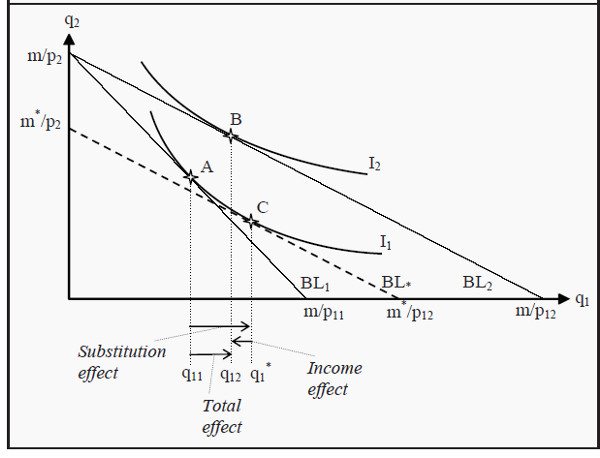
Figure 5.2: Income and Substitution Effects for an Inferior Good
In Figure 5.2, we have almost the same situation as in 5.1. The difference is that the consumer’s indifference curve I2 has been changed so that it touches the budget line BL2 at a point between points A and C. This change makes the income effect negative and the total effect is smaller than before.
In Figure 5.3, the indifference curve I2 has been changed again, so that it touches BL2 at a point to the left of point A. The income effect now becomes very negative, so negative that it dominates over the substitution effect. The total effect thereby also becomes negative and we have a Giffen good.
Note, however, that the consumer does increase her utility. This can seem strange, as the total effect is that she consumes less of the good analyzed (and we have assumed that more is always better). The drop in the price of the Giffen good means that the consumer can afford to buy more of other goods. Furthermore, these other goods function as substitutes for the Giffen good. Hence, the increase in utility. The increase in consumption of good 2 can be read off as the distance between A and B on the Y-axis.
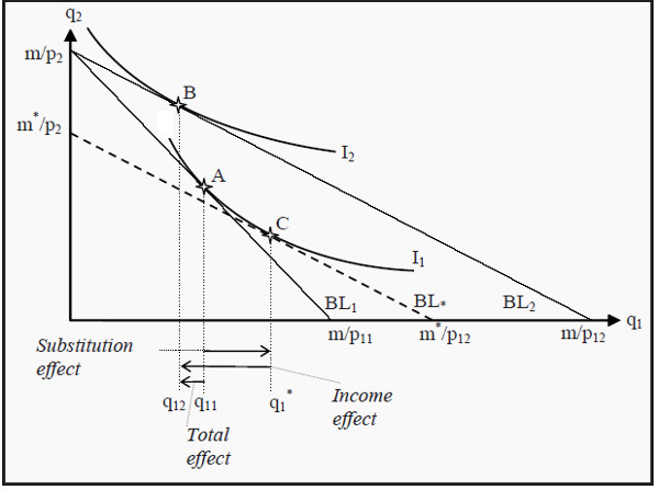
Figure 5.3: Income and Substitution Effects for a Giffen Good
Choice under Uncertainty
The situations we have discussed up to this point have all lacked any elements of uncertainty. Individuals and firms have made their choices knowing what the outcomes would be. That is, of course, very unrealistic. Most of the time, we cannot be certain about which consequences our actions will have, even though we can perhaps know which consequences they will probably have.
A few examples of important decisions under uncertainty are:
- Buying a house or an apartment. You know what you pay for it, but what will it be worth when you sell it? What happens if the house burns down?
- Investments in an education. It is often easy to get statistics on today’s salaries but in the future, they might change substantially.
- A firm invests in a new factory. Will the goods produced in the factory still be in demand in the future? Think, for instance, about the computer market where development is very rapid.
It is common in economics to view uncertainty as a sort of lottery. In a lottery, one often knows which outcomes are possible: There might, for instance be a list showing how much you can win. It is also possible to calculate the probabilities for the different outcomes. In the situations covered here, we will also assume that this is the case.
Expected Value
In statistics, “expected value” is a technical term. Suppose we toss a coin. If “heads” comes up, we win 5; if “tails” comes up we lose 5. The expected value of that lottery is then

Here, Pr(.) is the probability that the event within the parentheses will occur. If there are more than two possible outcomes, the expected value is the probability of each outcome multiplied with the value of that outcome, and then summed together. Note that the expected value need not to be something you would expect to occur. In the lottery above, we do not expect the outcome to be 0. We expect it to be either +5 or -5.
The expected value can be seen as a sort of average over the outcomes, where an outcome with high probability has a higher weight than one with lower probability. A lottery with an expected value of zero is called a fair lottery. Note that most real-world lotteries are not fair.
Expected Utility
Consider a case where an agent has to choose between several alternatives, all of which will lead to an uncertain outcome. A naïve method could then be to analyze them as if they were lotteries, and then choose the one with the highest expected value. There are several reasons why such a method would not be a good one.
To begin, we need to define a utility function (compare to Section: More than Two Goods ) over wealth. Usually, more wealth is better for an individual but as she becomes wealthier additional wealth matters less and less. The utility an individual has of wealth is often written as
U = U(W)
U stands for utility and W for wealth. The expression can then be read as “the utility level is a function of wealth.” What form the utility function takes varies between individuals, but a function that is often used for illustrations is

In Figure 6.1, we have drawn this function (sqrt = “the square root”). Note that the slope of the function becomes less and less steep. That means that the individual, as we just noted, receives less utility of extra wealth as she becomes wealthier. Note that how much extra utility the individual gets from a small increase in wealth corresponds to the slope of the utility function. The slope is called the marginal utility, MU.
We differentiate between three different kinds of utility functions
- Diminishing marginal utility. The slope decreases with increased wealth, such as the utility function in Figure 6.1.
- Constant marginal utility. The utility function is straight line, i.e. the slope is constant.
- Increasing marginal utility. The slope increases with increased wealth.
If we use the utility function together with expected value, we can calculate the expected utility. Suppose our wealth is 5. If we participate in the lottery above, we will either win 5 or lose 5, both with a 50% probability. The result will then be that we have either 0 or 10. The utility we would have of these outcomes, and the expected utility is then

E(U) stands for expected utility. Earlier, we calculated the expected value of the lottery to 0. Our expected wealth, as opposed to expected utility, is then 5 + 0 = 5 (the sum of what we have plus the expected value of the lottery). Note now that, the utility we have from a certain wealth of 5 is

The utility from getting the expected value with certainty (the utility of 5) is usually higher than the expected utility of participating in a fair lottery (the utility of either 0 or 10, both with a 50% probability). We will study this more closely in the next section.
Risk Preferences
Study Figure 6.1 again. We have a wealth of 5 plus an uncertain outcome of a lottery. Together, these give us an end wealth of either 0 or 10. We have indicated these values on the X-axis. The corresponding utilities we have indicated with points a and b. The expected utility of the wealth plus the lottery will be a point somewhere along a straight line from a to b, depending on the probability of each outcome. In the present case, the probability for each outcome is 50%
and then the expected utility will be a point exactly half-way in between a and b, i.e. in point c where the utility is 1.6. (With other probabilities, we would have ended up in another point on the same straight line.) We have now illustrated the expected utility of an uncertain outcome of either 0 or 10.
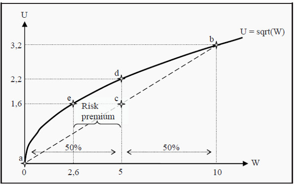
Figure 6.1: Utility Function
What if we chose not participate in the lottery at all? In that case, we would keep a certain wealth of 5. The expected utility is unchanged: The expected value of a certain 5 is 5, and the expected value of a certain 5 plus the lottery is also 5. However, the utility of a certain wealth of 5 is 2.2, corresponding to point d in the figure.
The outcome that, participating in the lottery gives less utility than not participating, depends on the fact that the utility function slopes less and less steep as wealth increases, i.e. that we have diminishing marginal utility. A person with such a utility function will always prefer not to participate in a fair lottery, and she is said to be risk averse.
Depending on which type of marginal utility an individual has (compare to above), we can classify her attitude towards risk:
- Risk averse (diminishing marginal utility). Prefers not to participate in a fair lottery. Most people, if not all, are risk averse. Note, however, that this theory (at least in the basic version presented here) is unable to explain why many people in real life participate in lotteries.
- Risk neutral (constant marginal utility). Is indifferent.
- Risk loving (increasing marginal utility). Prefers to participate in the lottery. A very unusual property!
Certainty Equivalence and the Risk Premium
Look at Figure 6.1 again. We have already seen that an ordinary person (i.e. a risk averse person) prefers not to participate in the lottery. One may then ask which level of certain wealth she would value as much as participating in the lottery.
As we saw before, her utility of participating is 1.6 (point c). The question is then which wealth would give her that same utility. Follow the line from 1.6 to the utility function and you will end up at point e, corresponding to a certain wealth of 2.6. This individual is, consequently, indifferent between participating in the lottery and having a certain wealth of 2.6. The value 2.6 is then said to be certainty equivalent to participating in this lottery.
Since she now has a wealth of 5, she is, in other words, prepared to pay 5 - 2.6 = 2.4 to avoid the lottery. Alternatively, if her wealth had been 2.6, how much would we have had to pay her in order to make her willing to participate in the lottery? The answer is the same: 2.4. This amount is called the risk premium.
Risk Reduction
Since most people are risk averse, they want to reduce risk. That is often achieved by pooling the risk and sharing it. This is, for instance, the idea behind insurance, where the risks are shared between many people.